Produced at
Deepblu
Deepblu E-commerce CRM
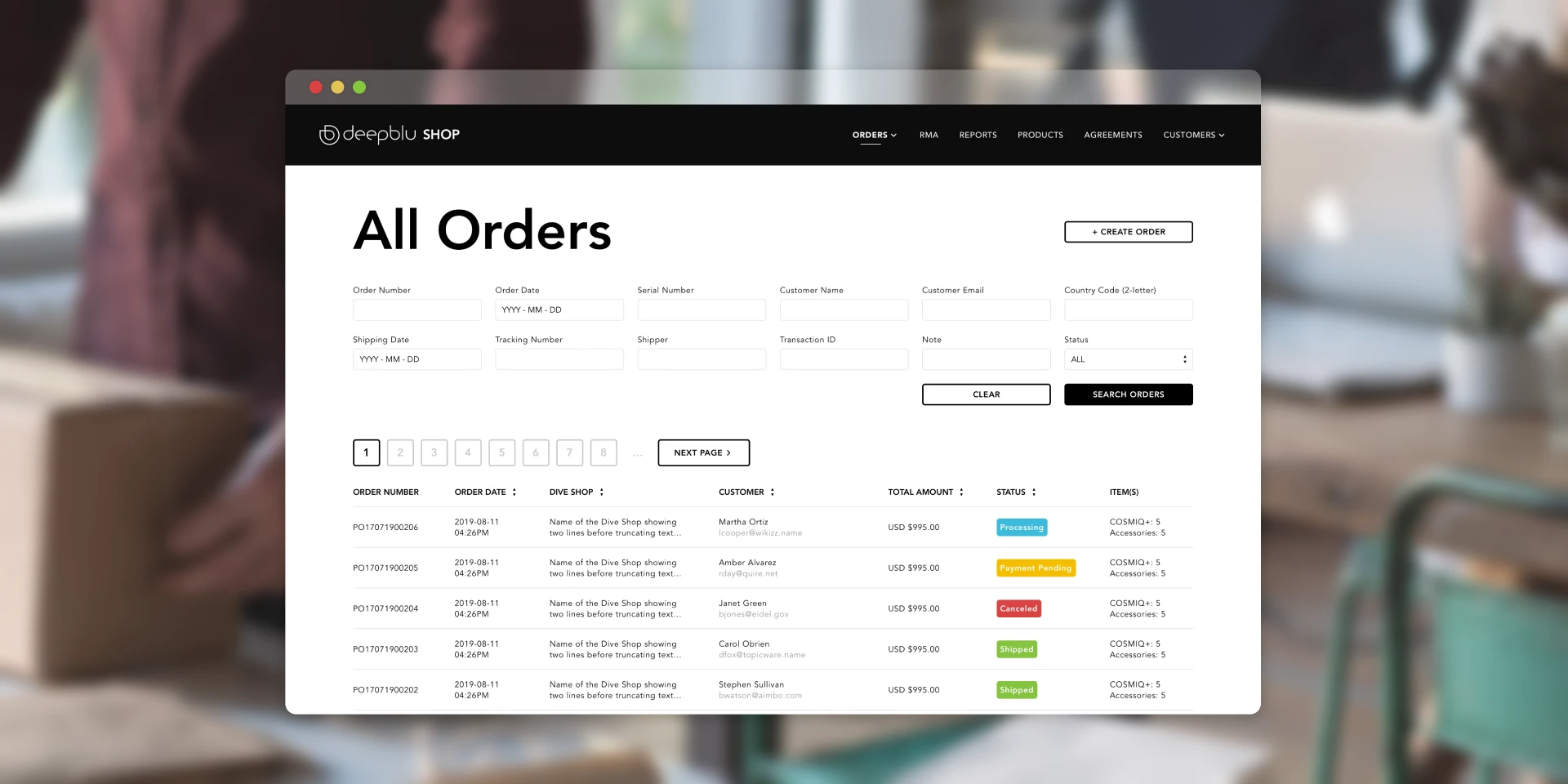
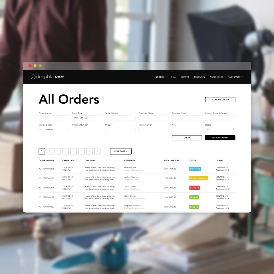
Since its launch, the Deepblu Shop's Internal E-Commerce Customer Relationship Management (CRM) has played a crucial role in our company's sales operations for 2 years. Our team relied on it for daily tasks such as handling orders, managing exchanges, and analyzing sales data. To enhance order fulfillment and inform smarter business decisions, the executive leaders decided to give the CRM a major makeover.
Deepblu
1 Month (Late 2018)
UX, UI
Completed
As the sole product designer, I took on the crucial task of addressing usability issues my colleagues faced and implementing executive leaders’ feature requests. I focused on understanding user challenges, designing user-friendly interfaces, and aligning design improvements with project goals. This involved refining our internal CRM to make it more intuitive and efficient, benefiting both our team and the organization.
1 Product Designer, 2 Executive Leaders, 2 Developers
Fulfillment Team: “Slow order preparation process.”
Customer Relations: “Hard to locate orders for issue resolution.”
Fulfillment Team: “Overlooking orders and return/exchange requests.”
Customer Relations: “Missing return and exchange requests.”
Customer Relations: “Updated content does not promptly reflect.”
Executive Leaders: “Sales figures lack actionable insights.”
Executive Leaders: “Inadequate options for period selection in reports.”
Executive Leaders: “Require advanced and country-specific pricing customizability.”
All Users: “Struggle with navigation and information architecture.”
All Users: “Lack of uniform search methods.”
All Users: “Elements need clearer labeling.”
… streamline the order preparation process?
… make it easier to search for orders?
… prevent orders from being accidentally ignored?
… ensure return and exchange requests are never overlooked?
… display edited content?
… offer sales figures that provide actionable insights?
… enhance date and period selection options in data reports?
… incorporate complex tier-pricing and country-specific customizability?
… improve overall navigation and information structure?
… implement uniform search methods ?
… enhance element labeling for improved recognition?
With a tight schedule of just one month for design and development, each decision made must optimize for efficiency. The constraints below guided the design process.
1. Changes must be quick to develop.
2. Minimum use of graphical elements.
3. Reuse as many existing elements as possible.
4. A month to design and develop.
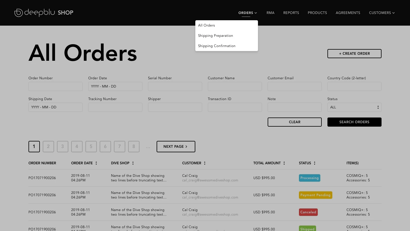
The approach was to prioritize frequently used functions on the left and less frequently used ones on the right. A quick meeting with colleagues confirmed the positive impact of these changes, as they found the navigation enhancements to be quite helpful.
Simplification of navigation proved essential. The earlier version of the system had every item crammed into the navigation bar, a consequence of its on-the-go development. Best practices suggest keeping the number of items in navigation to a manageable limit, ideally under 7. By rearranging elements, I managed to condense the navigation down to 6 items.
The first round of iterations were focused on tackling the Efficiency of Use and Error Prevention issues faced by the fulfillment and customer relation teams. I sat down with the team members who use the Internal CRM everyday to further discuss issues. These sessions gave me the insights I needed for the initial round of improvements.

The second round of iterations centered on providing “useful data” and enabling more “pricing flexibility” for the executive leaders. I had a meeting with the them to find out what their requirements were. We also had a few brainstorming sessions to come up with potential solutions.

In the final iteration, the goal was to create a unified solution that met our objectives with minimal development complexity. My background in HTML, CSS, and a basic understanding of React JS allowed for smooth collaboration with developers, seamlessly integrating their insights.

Through three rounds of improvements, our design came together. Navigation was smoother, order processing faster, returns more straightforward. These decisions were shaped by user feedback and close collaboration with developers, resulting in a user-friendly system aligned with our goals.
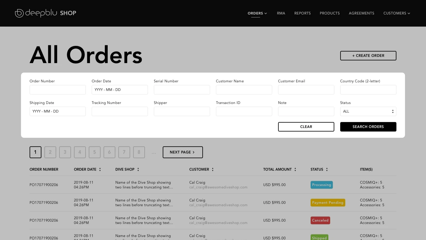
Locating the correct order had become a time-consuming task for our teams. With tens of thousands of orders within our system, tracking down a specific order was becoming increasingly challenging.
By reviewing actual orders in our backend system, I identified elements that could work as unique identifiers. While the order number is the preferred identifier, sometimes customers don’t have the receipt or immediate access to it.
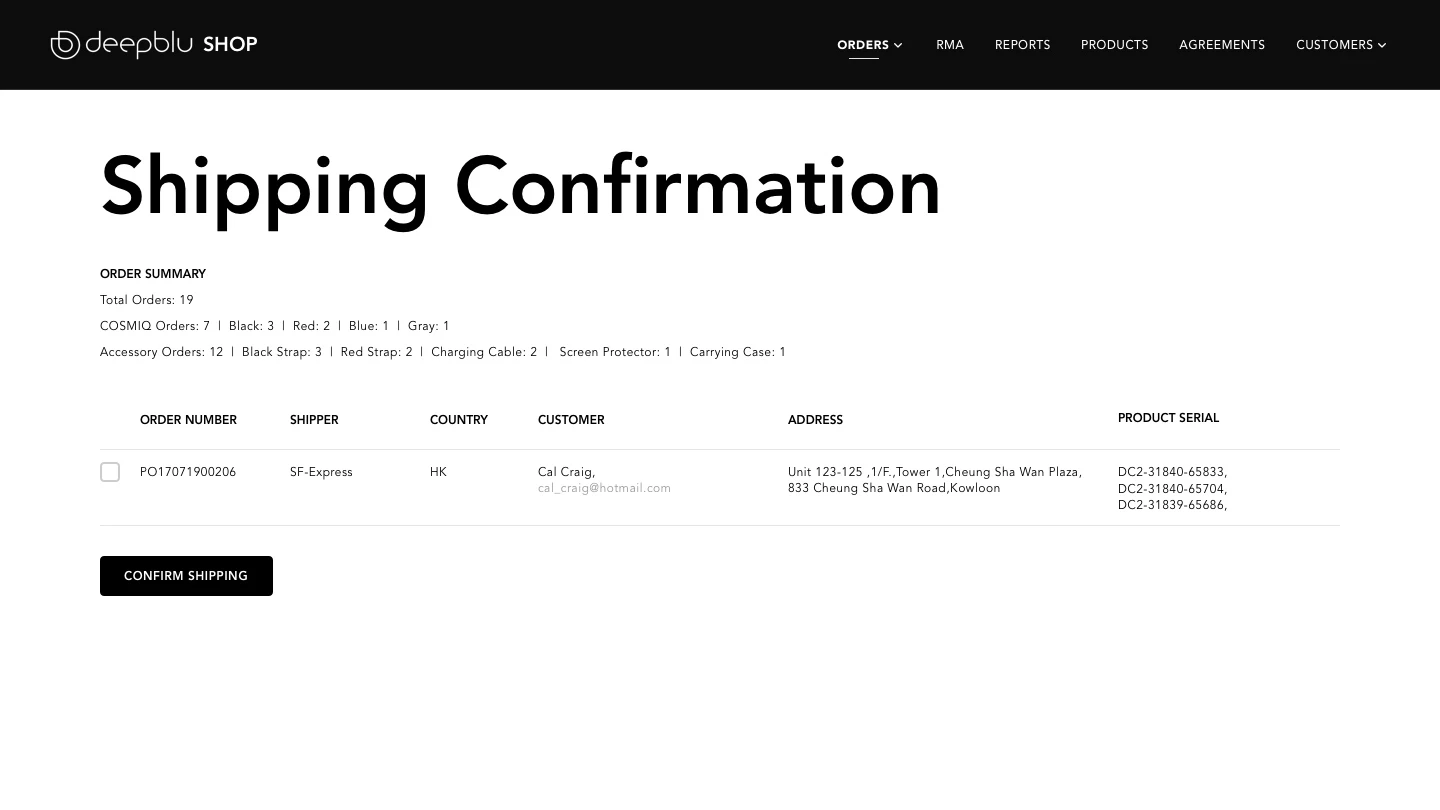
Upon completing order preparation, a second team member would ideally cross-check the order in the ‘Shipping Confirmation’ view.
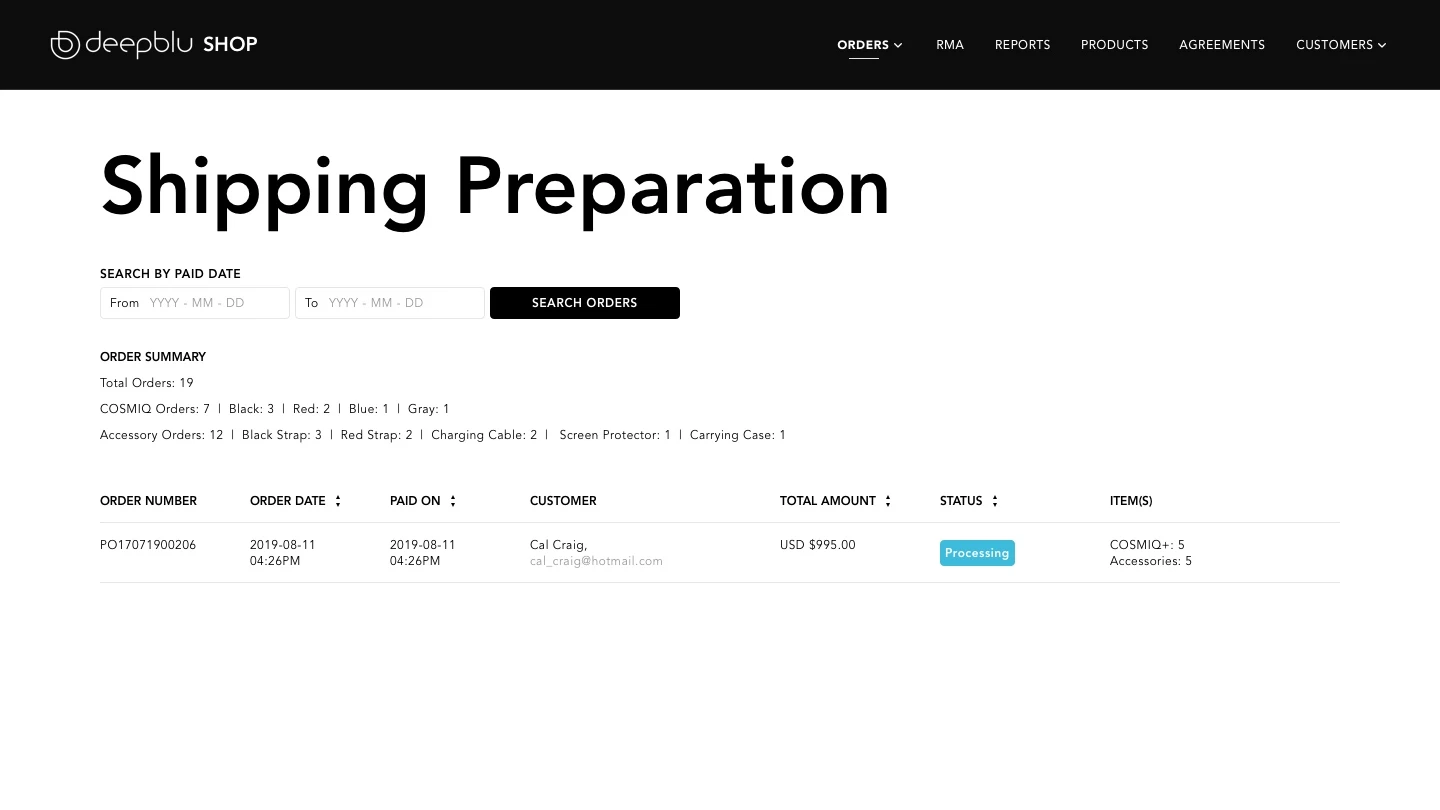
In the earlier version, the reliance on the ‘All Orders’ page during order processing posed a distraction due to the presence of unrelated orders. To address this, a dedicated ‘Shipping Preparation’ view was introduced. This view exclusively displayed orders with completed payments and ready for shipping.
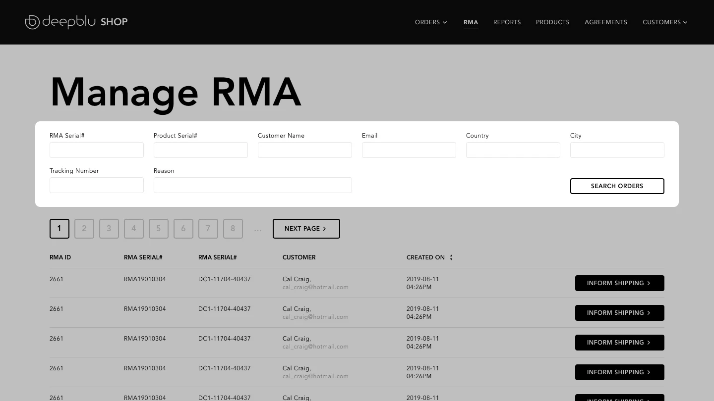
While every company aims for complete customer satisfaction, returns and exchanges are a natural part of the process. Delays in service, often due to difficulties in locating requests, occasionally posed challenges.
To tackle this, I optimized the search fields exclusively for Return Merchandise Authorization (RMA) requests. The unique identifiers for RMA requests differ from those for Orders. The RMA number, Product Serial, and Reason emerged as particularly crucial. The unique serial of the product precisely pinpoints the unit and batch, while coded Reasons, determined by our customer relations team, assign priority to different cases.
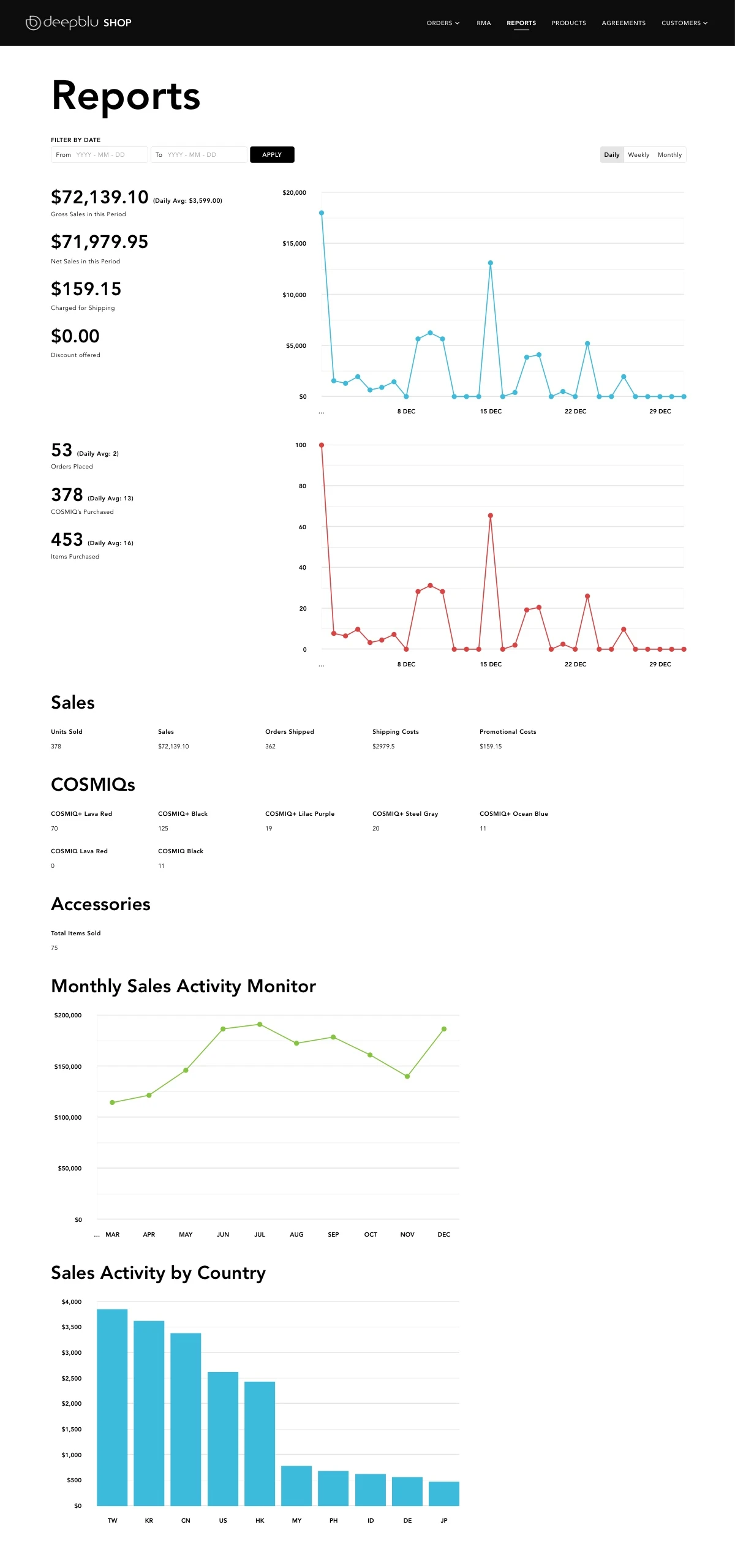
To equip executive leaders with valuable insights, the reports tab offered a comprehensive overview of the current month’s sales report. The timeline was adjustable to suit their requirements. The sections included:
The Products management section contained a considerable level of complexity. The Edit Product page was organized into five distinct segments: basic information, pricing, frontend content, variations, and availability.
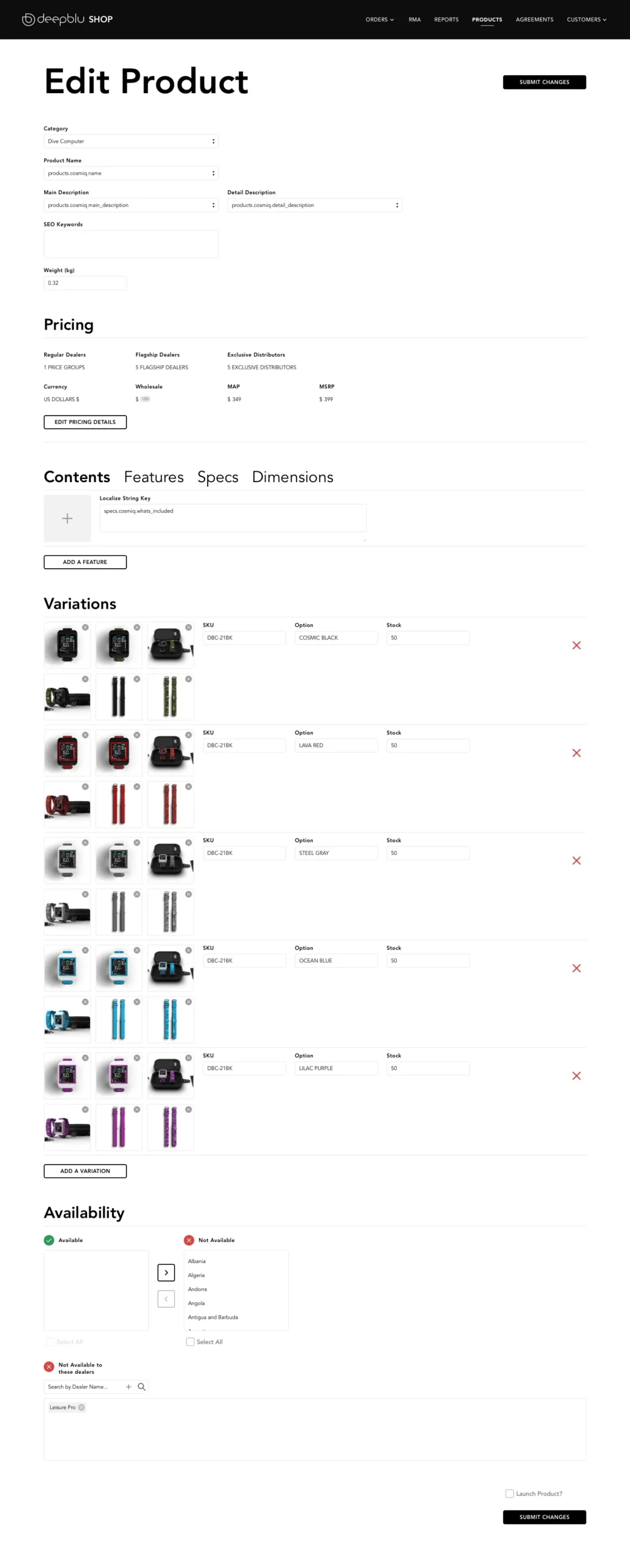
This section can be treated as a product selector. Only our developers could add a new product or a new category. Given that new product launches were infrequent, this limitation wasn’t a concern.
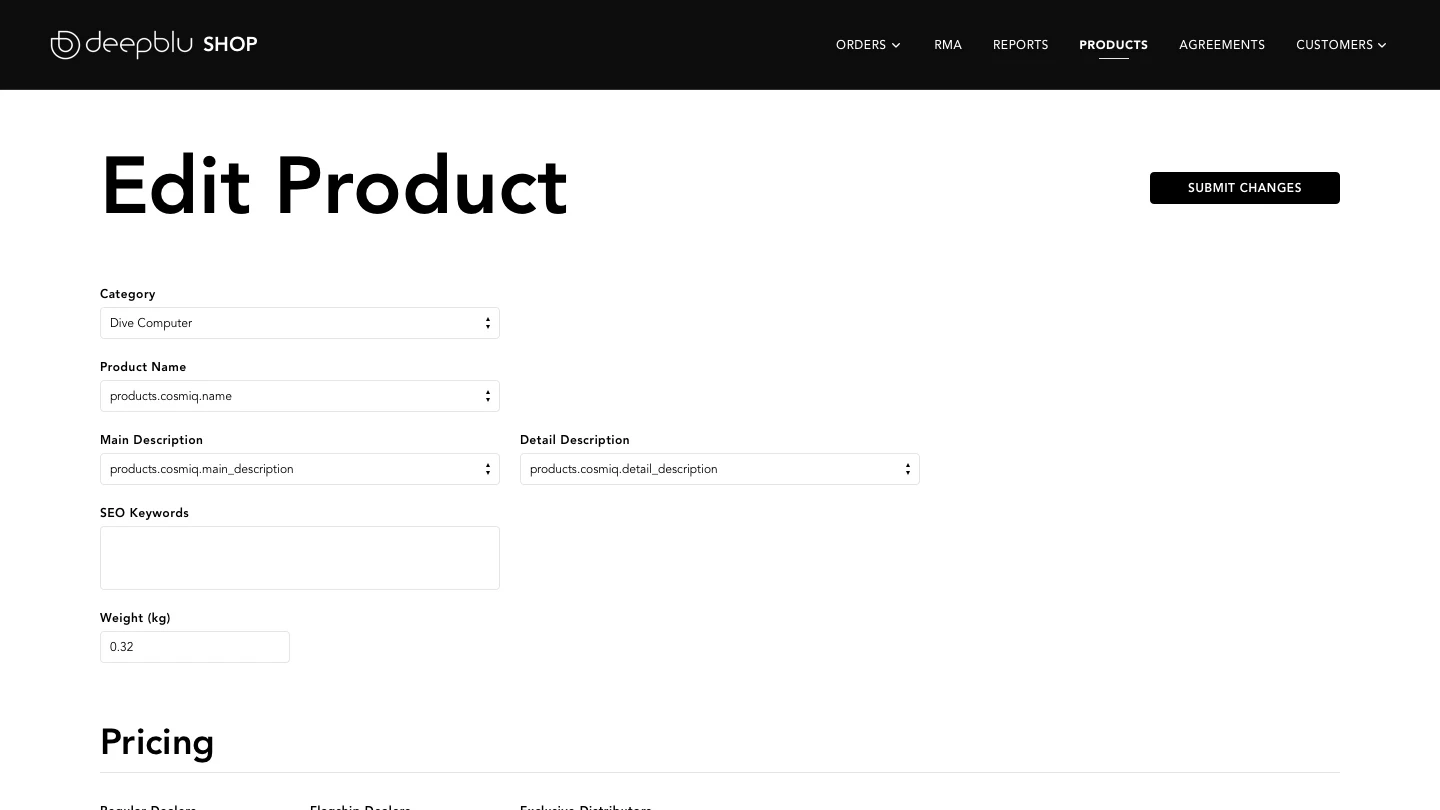
The Pricing segment played a crucial role in aligning with executive leaders’ new marketing campaigns. More insights into this aspect will follow.
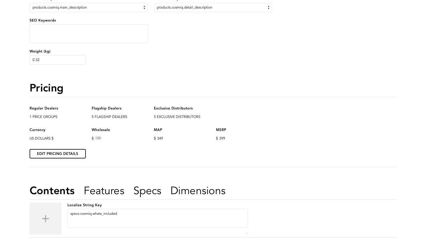
Content entered by our editors here directly influenced product pages on the frontend of the Deepblu Shop. The four tabs corresponded to different segments of frontend content.
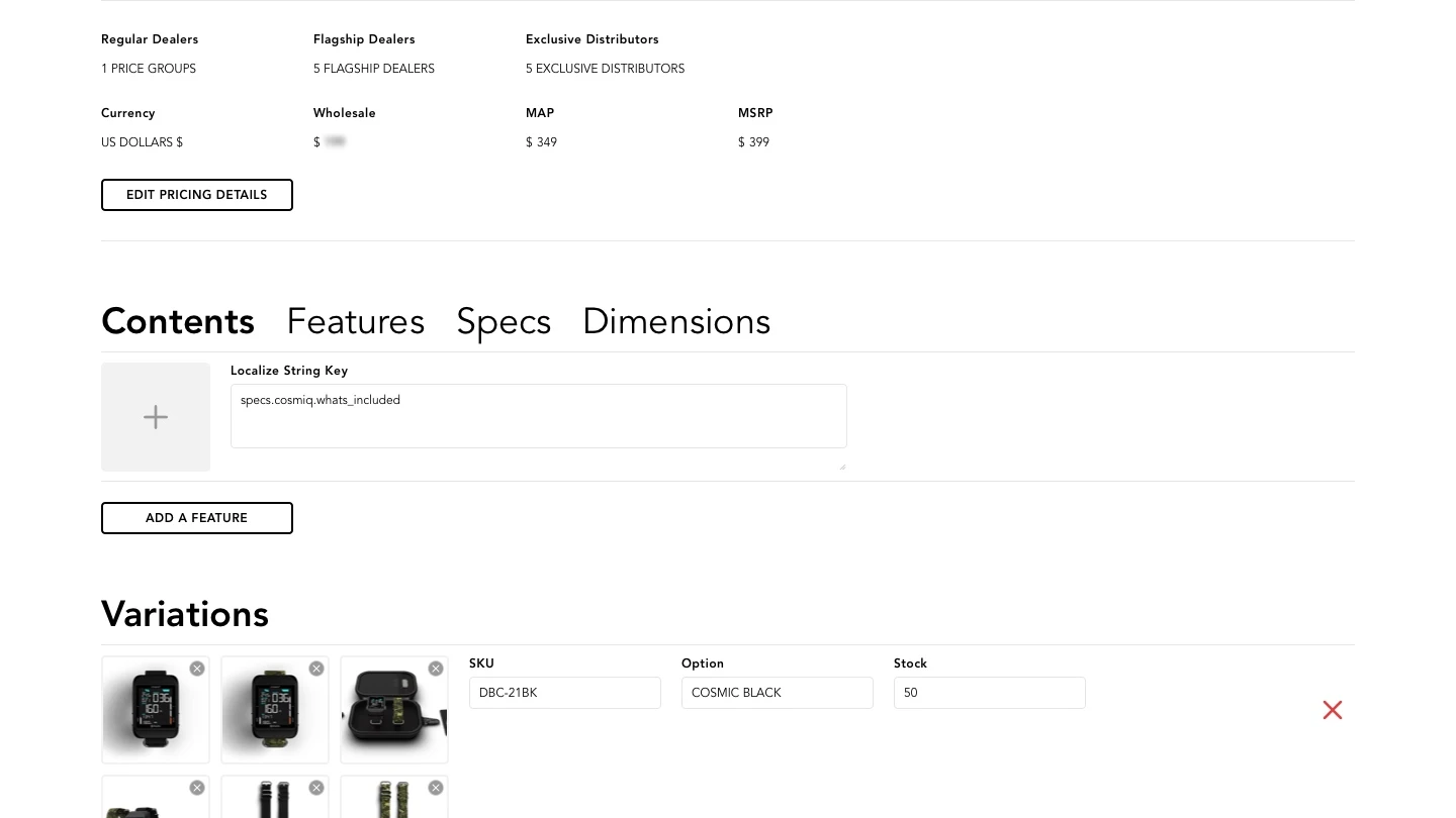
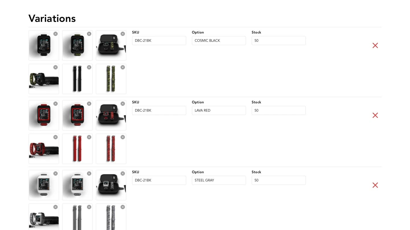
As the name suggests, this segment was dedicated to managing product variations. My role included creating product renderings and images to be uploaded here.
The image upload feature was in need of a revamp. Notably, this segment lacked preview thumbnails previously, resulting in errors and a lack of visibility into system status. The addition of preview thumbnails led to a significant improvement in usability.
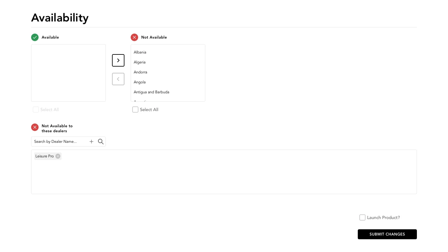
Driven by strategic business needs, occasional shifts in inventory across geographical locations became necessary. This new functionality empowered executive leaders to temporarily halt sales in specific regions and for particular dealers, aligning with the dynamic demands of the business landscape.
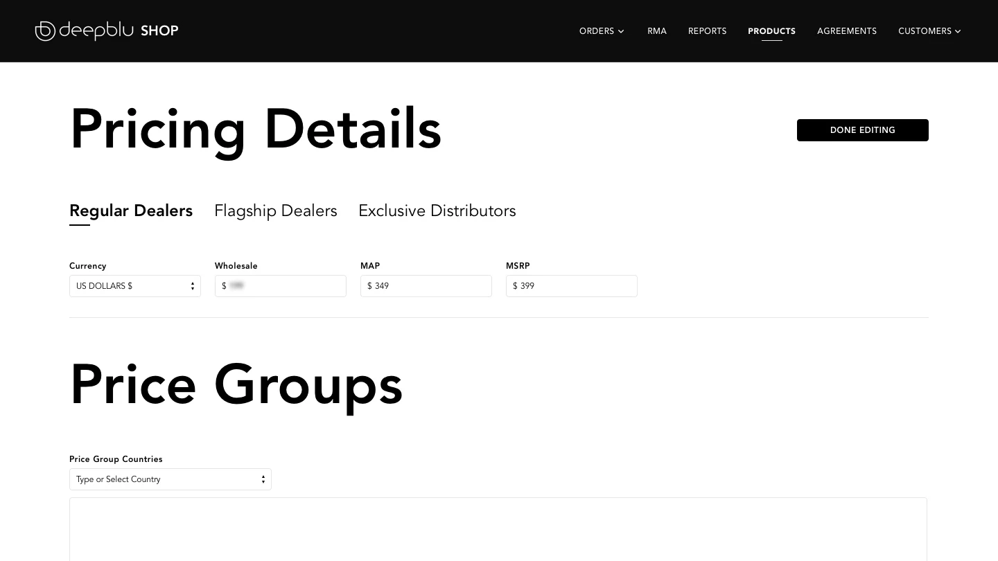
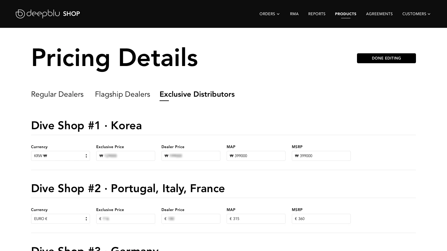
The executive leaders needed a comprehensive pricing system that allowed for a lot of flexibilities. There was a need for 3 types of dealers: regular dealers, flagship dealers, and exclusive distributors. On top of that, they required a “Price Groups” feature that can organize several countries into a price group for extra price adjustments.

The executive leaders needed a comprehensive pricing system that allowed for a lot of flexibilities. There was a need for 3 types of dealers: regular dealers, flagship dealers, and exclusive distributors. On top of that, they required a “Price Groups” feature that can organize several countries into a price group for extra price adjustments.

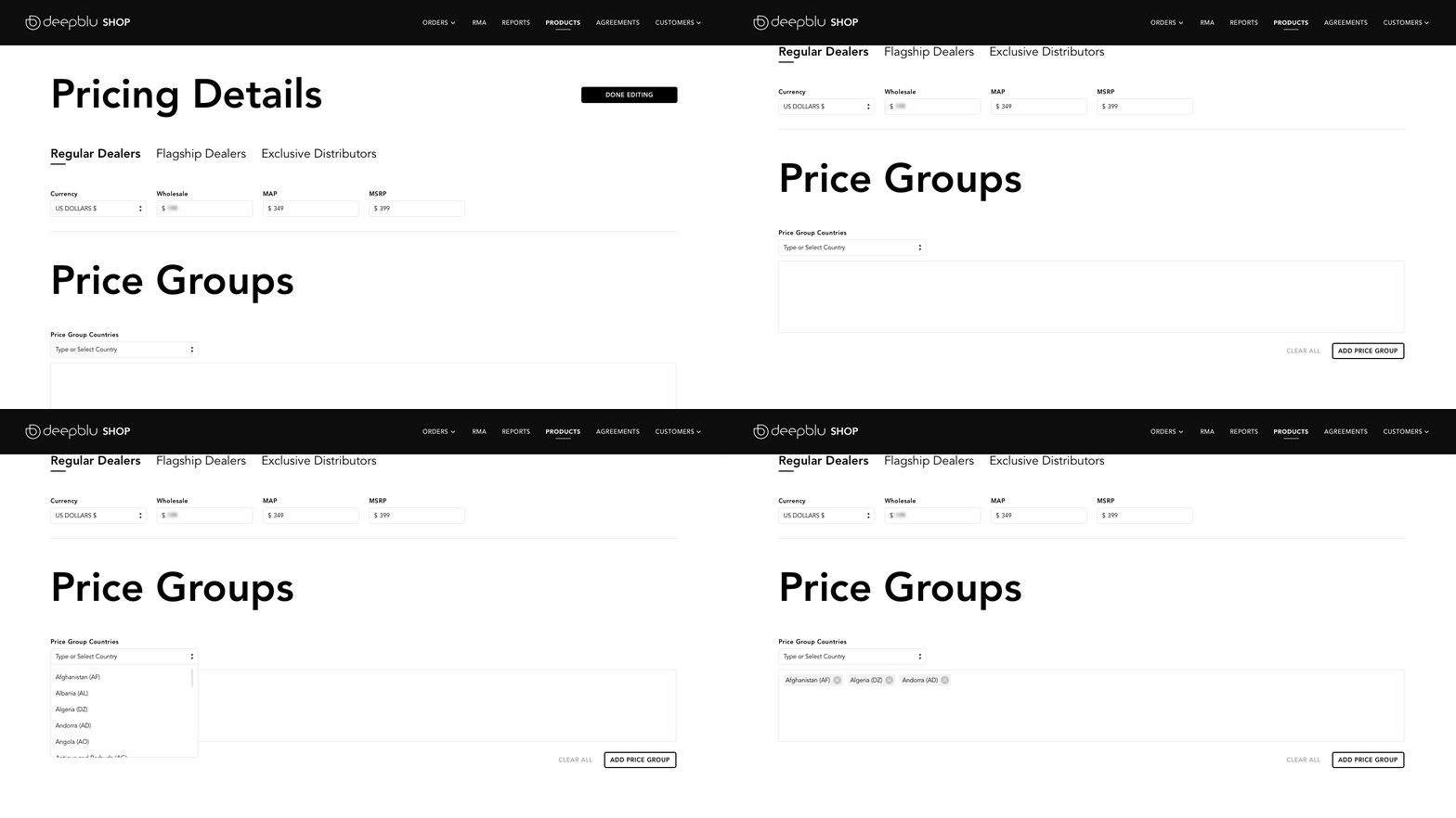
Regular dealers were given 3 prices: a wholesale price when they buy 3 or more units, a Minimum Advertised Price (MAP), and a Manufacturer’s Suggested Retail Price (MSRP). These prices were set by 3 simple text fields and a currency dropdown controlled.
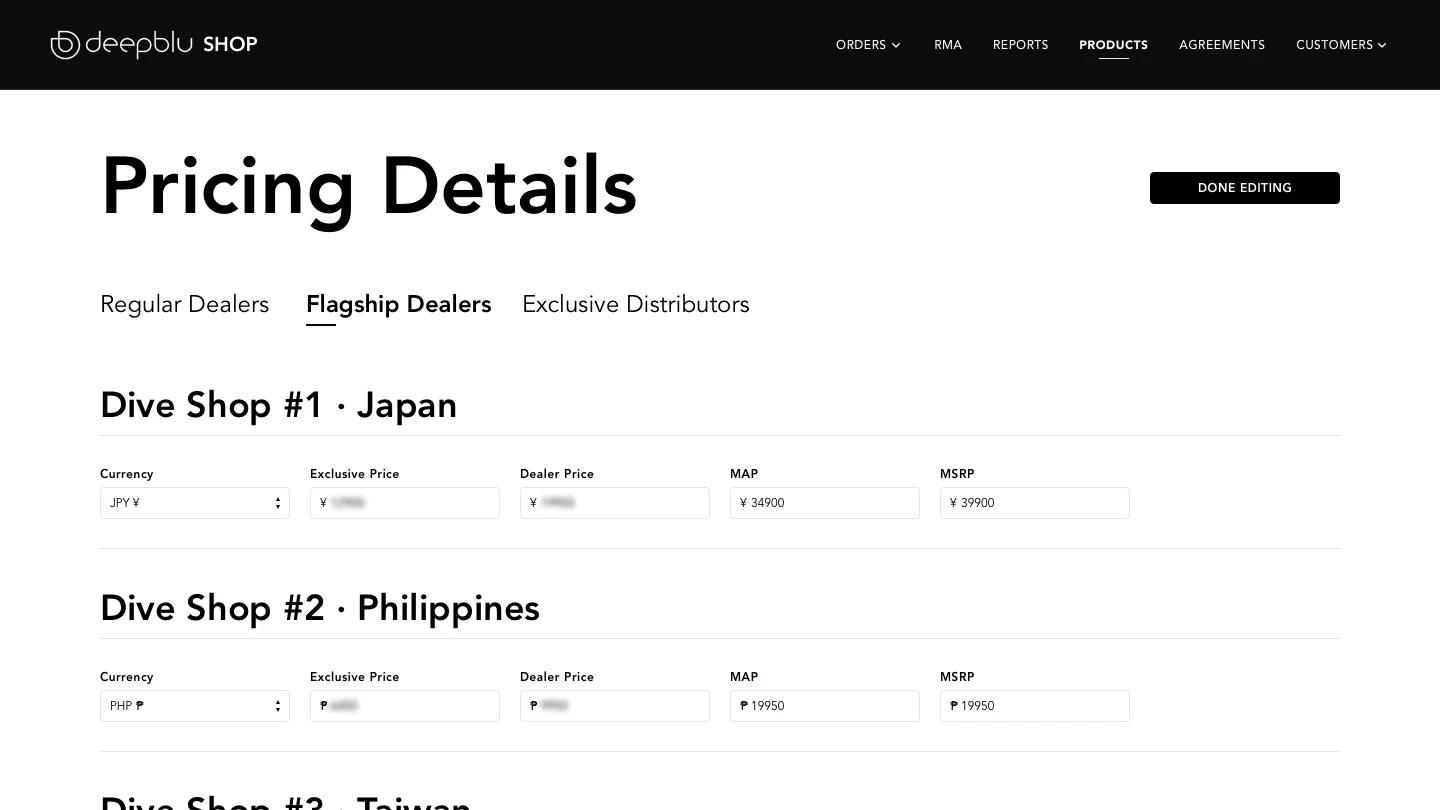
Flagship dealers were individual arrangements with larger dive shops and operators. They were given an additional Exclusive Price that could be attained by buying 5 or more units. Since flagship dealers are signed on with unique contracts, adding a new dealer was done by our developers and not with a user interface.
Exclusive dealers were similar to flagship dealers in terms of business arrangement and pricing. The main difference between the two is that they have the exclusive right to sell our products in their respective geographic region.
There was a need for certain countries and regions to have separate pricing strategies due to local tax laws or particular economic reasons. The business leaders could add countries in a group and assign prices to the group accordingly.
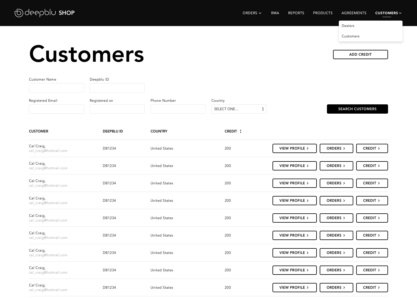
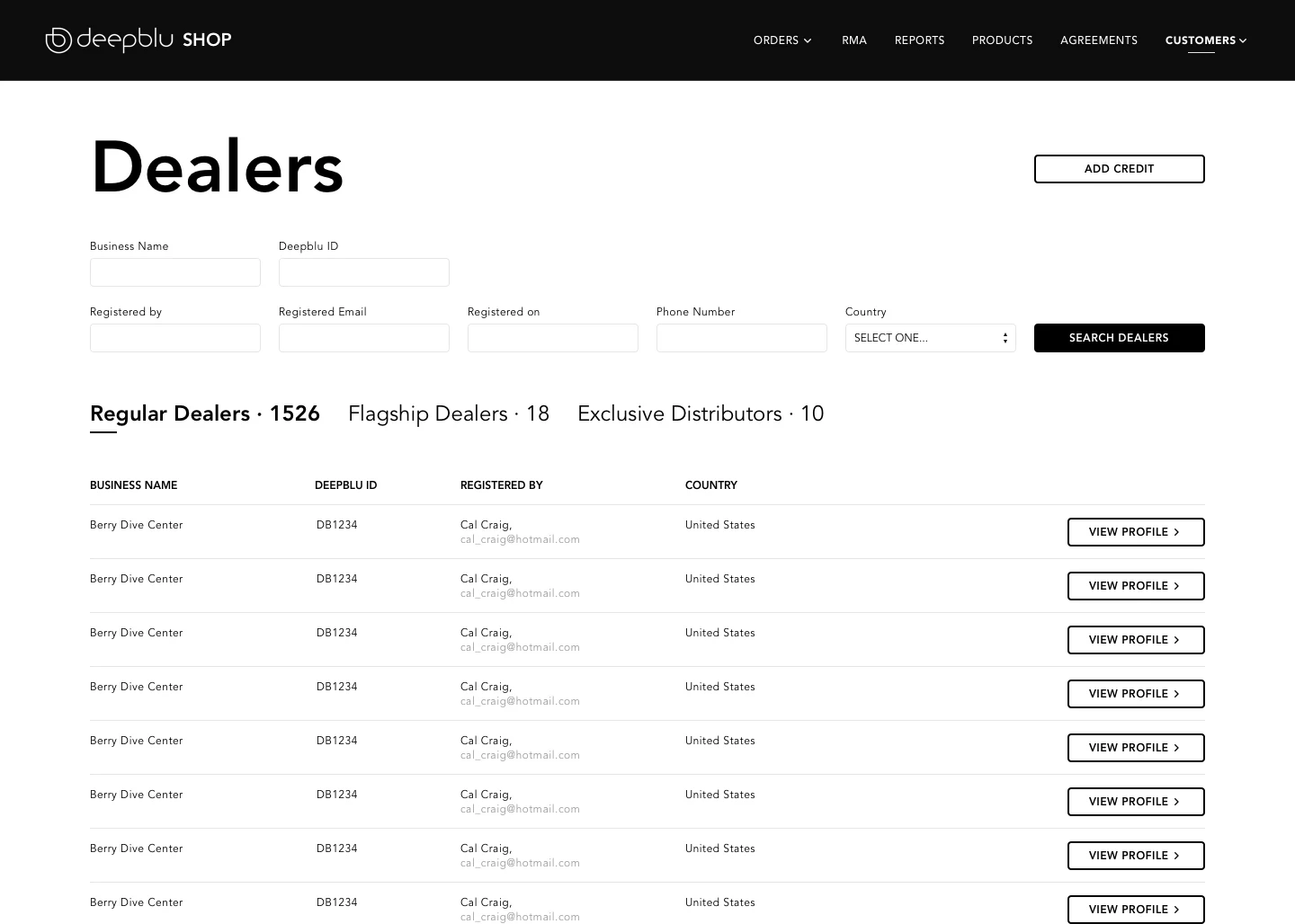
Within our customer base, we had two main groups: regular customers and dealers. Dealers were further categorized into three distinct groups. The functions of this system were as follows:
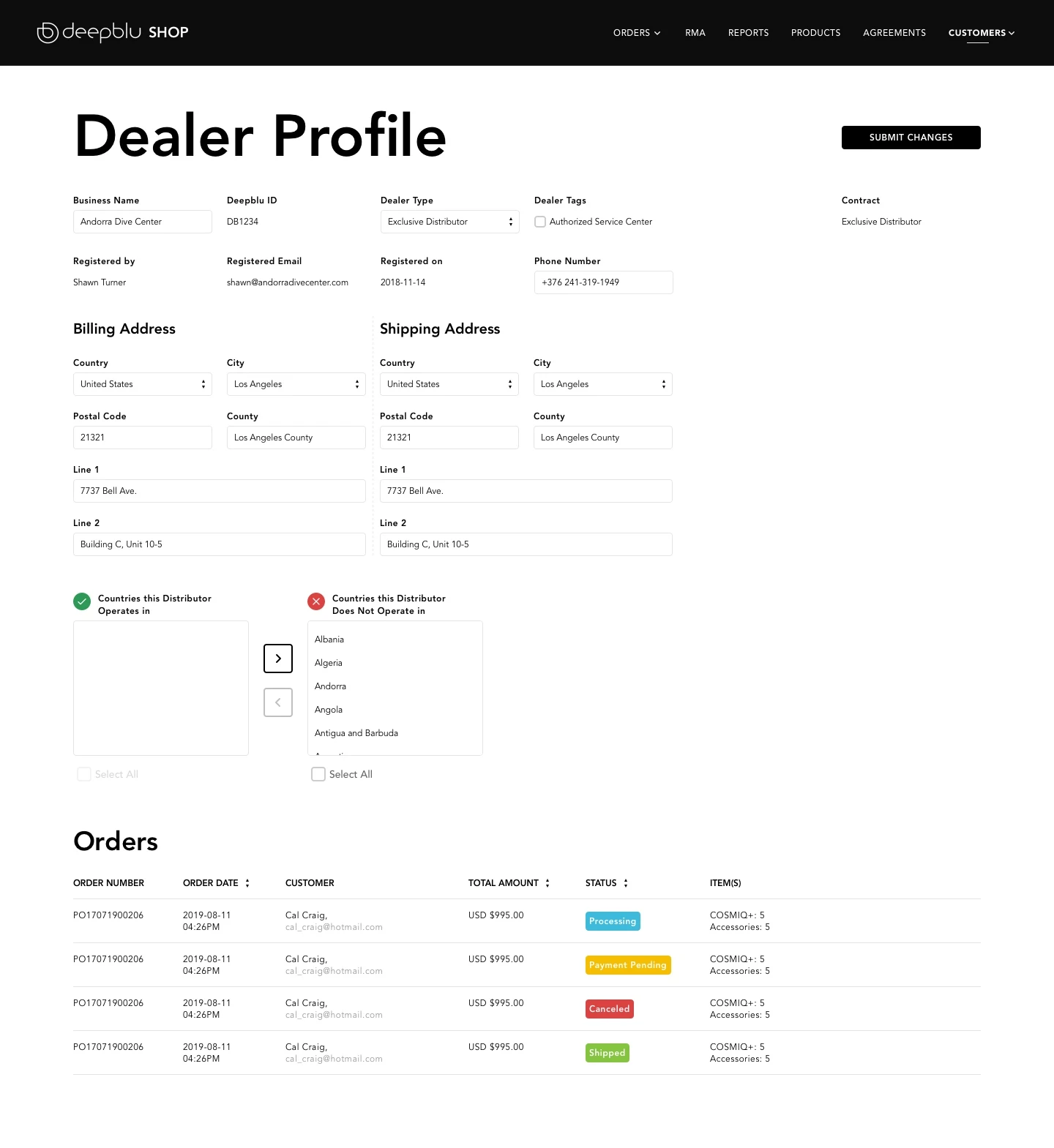
All these improvements resulted in a significant transformation. The streamlined design solutions led to a remarkable 25% reduction in order processing time and a tangible boost in overall productivity. Through user-centric design, we were able to balance the practical needs of our colleagues and the strategic goals of the business.
The project made daily operations smoother and also improved the organization’s ability to make informed decisions and drive better business outcomes.
Fulfillment Team: “Fast order preparation process.”
Customer Relations: “Easy to locate orders for issue resolution.”
Fulfillment Team: “Focused view of orders and return/exchange requests.”
Customer Relations: “Clear view of return and exchange requests.”
Customer Relations: “Updated content promptly reflect.”
Executive Leaders: “Useful sales figures.”
Executive Leaders: “Comprehensive period selection in reports.”
Executive Leaders: “Advanced and country-specific pricing customizability achieved.”
All Users: “Clear and concise navigation and information architecture.”
All Users: “Uniform search methods for all data forms.”
All Users: “Elements have apt labeling.”